Draw Maps That Draw Your Players Into Your World

You don’t need to be a cartographer to create your own hand drawn maps. And a hand-drawn map has a magical property: It brings something from the character’s world into the player’s world. In less than 30 minutes, you can create a map that engages your players in the world you have created for them.
Last month we featured a step by step guide to make spell scrolls. This posts follows on with a few tips for mapping, and a few examples of techniques we mentioned in the previous article. If you haven’t read that one, you may want to skip through it. We’ll use some of the same techniques.
Tolkien Wasn’t That Good At Drawing
The thought of creating my own map was initially very intimidating. The official DnD guides and adventures are full of gorgeous maps illustrated by professional artists. The thought of tossing my own hat into that ring seemed unthinkable.
Nevertheless, I tried drafting a few. They did not come out well. I used one in-game… but I was embarrassed (even though the players seemed to think it was fine). The rest I threw away. I decided to just use maps created by professionals.
Then something happened that changed my mind. My daughter asked me to read the Hobbit to her. I flipped open my copy of the classic J.R.R. Tolkien novel that (let’s be honest) inspired so much of the DnD universe. And it struck me. Right there in the front is a map. In a second I was transported to my own childhood when I studied the map with religious zeal. But now, with my newly critical eye (based on my mapping “failure”), I was shocked to notice that the map wasn’t very good! Letter spacing was off. The calligraphy was inconsistent. Some of the sketches were a little… dare I say this about such a marvelous author… amateurish?

And in that moment, I realized that those imperfections were part of the charm, part of the magic of Tolkien’s world. I could imagine Bilbo frittering away an afternoon at Rivendell sketching the map with a quill pen. And that made the map a glorious connection to the world I wanted to be part of.
Why, then, was I so worried that my own maps weren’t perfect?
With that realization, I began drawing maps in earnest–and embracing all of the flaws.
Playing Online: Even when playing online, I hand-draw maps. I scan them in and load them up into Roll20, using them as handouts. If you would like to do this, I suggest not using the crumpling technique here, as it does not work well for scanning.
The Materials
Just like the spell scrolls from last month, you’ll only need a few things:
- 1 piece of parchment-looking card stock
- A pencil
- A ruler
- An eraser
- One or more permanent ink pens (I used a few black pens, and one red pen)
Optionally, you can use the same extras we used in the spell scroll article:
- A distressing ink pad and applicator
- Rubber stamps and ink (or embossing powder or whatever you like)
Step 1: Sketching
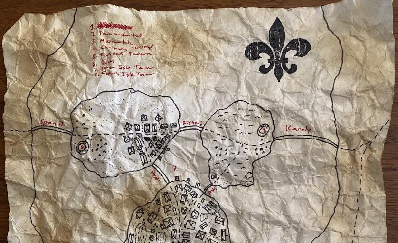
The map I am using for this post is based on the island drawing we covered in our review of Campaign Cartographer. The town of Nine Bridges spans four small islands in a wide river.
Using a pencil, sketch out the rough outline of the locale that you want to create. Some people go into detail while sketching. I just do the main borders and areas. The lighter your sketching is, the easier it is to erase later.
Previously Loot & Liar has talked about creating encounter maps on a grid. In that case, it is important to scale things correctly and consistently. But on overland maps, treasure maps, and so on, you do not need to worry about scale. Again, take a look at some of Tolkien’s maps. While there is a general sense of distance, there is not a specific sense of how far one thing is from another. Deven Rue, who does the maps for Critical Role, creates gorgeous maps that prioritize illustrating the treacherousness and danger of a hero’s journey.
Step 2: Inking in Details
Most of the work happens in this step. I suggest using a fine-tipped felt pen or an artist’s technical pen. And I highly recommend permanent ink.
Start by tracing over the lines on your pencil sketch, then begin filling in detail and labeling. Here are a few tips:
- Stick with simple iconography: Triangles for mountains or trees. Rectangles with X’s for houses. Lines and dotted lines for borders, shores, roads, and so on. Keep it simple.
- Sometimes it is easier to read text if it is in a different color.
- If it is helpful to make a key, use a key. But if that feels like clutter, feel free to leave it off.
- Let the map tell part of the story. In the example above, the first destination in the key is scribbled out. The players assumed at first that the map had a mistake… only learning later that the NPC who gave them the map was purposefully obscuring the name of a location.
- Take a look at similar maps on Instagram, Pinterest, etc. Not only can you gain some inspiration, but you can see how others used simple iconography to send their players headlong into adventure.
When you are done with this step, let the ink dry well. Then go back with an artist’s eraser and remove all your sketched lines.
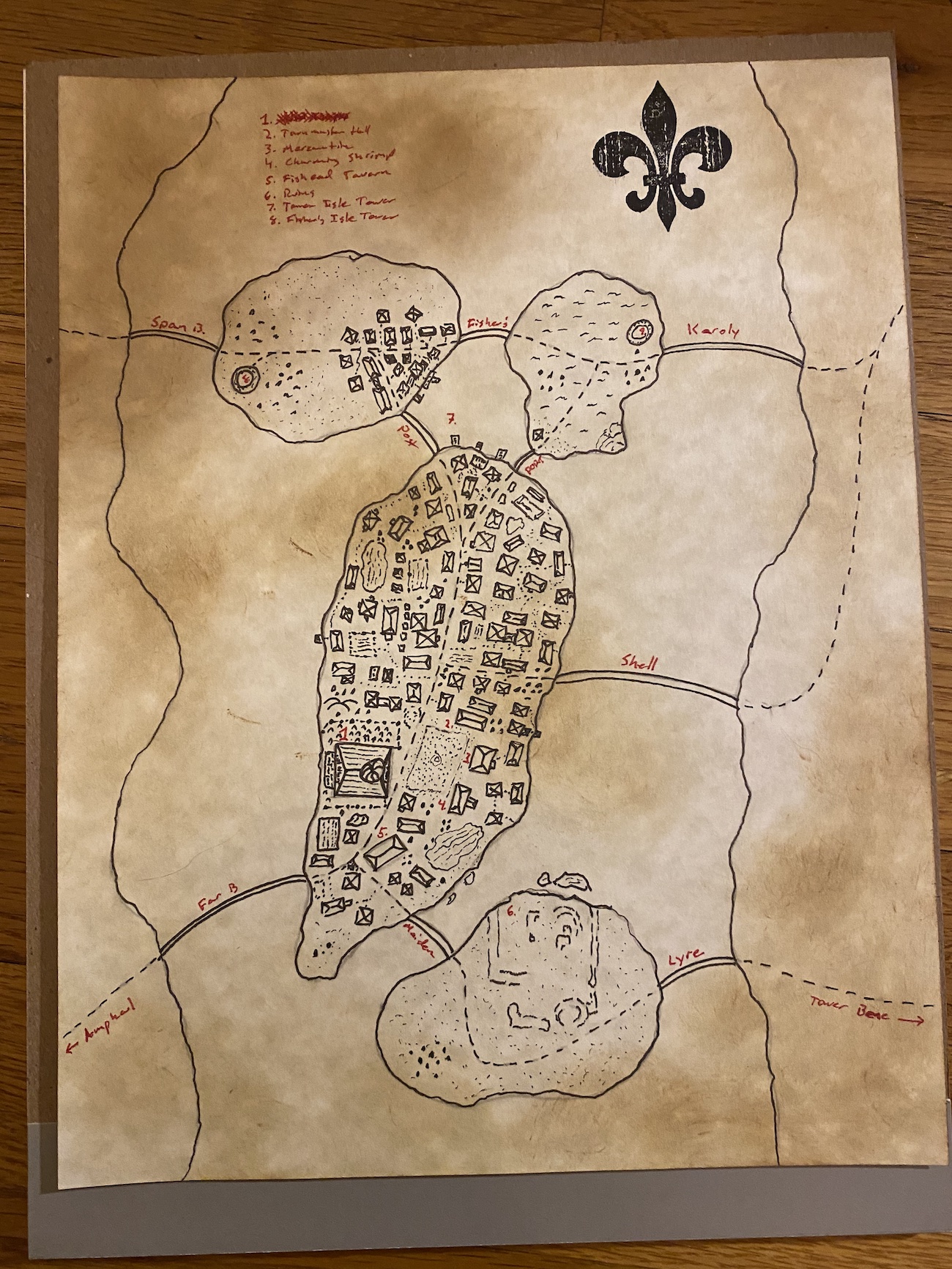
At this point, your map can hit the tabletop. In the next few steps, we add more embellishments that make it feel even more authentic. A few of those effects can be seen in the picture above. The easiest way to “age” your map is to do the crumpling technique in step 5.
Step 3: Aging the Map with Distressing Ink
If you have distressing ink and a cotton applicator, you can make the parchment look even more authentic by gently applying distressing ink in a few locations on the map.
Thinking about how the map is stored may help you decide where to put the ink. If the map is rolled up, then the edges of the paper will be the most distressed. If the map is folded, then the areas along the fold lines will also be distressed. (You might want to fold the map now, and then distress along those lines.)
In the article on spell scrolls, we applied the ink after crumpling the paper. That emphasized the ridges in the paper. This time, we are applying the ink prior to the crumpling. This gives more of a feel of mouldering in disuse, rather than traveling from adventurer to adventurer.
Some distressing ink can simulate water damage and oxidation. This is achieved by spritzing the paper with a squirt bottle of water. If you decided to go this route, make sure you let the paper dry thoroughly before proceeding to the next steps.
Step 4: Stamps
I love using rubber stamps to add “official” appeal to something. A chevron or seal or even a compass point or dragon stamp can make a hand-written page feel more authentic.
In the map pictured above, I used the same fleur de lis stamp we used in the spell scroll article. This time, though, I just used black ink and didn’t try embossing powder. This gives it bold solid color, and functions a little like a compass point.
If I had used embossing powder, then the next step, crumpling, could come out badly, as the embossed stamp might crack and peel. (Then again, that might make a really cool effect.)
Step 5: Crumpling
Just as with our spell scroll, this step consists of crumpling and smoothing the paper in sequence for several minutes. Crumple the map into a tight ball, then smooth it flat. Then crumple. Then smooth. Do this until the paper feels soft and is full of wrinkles.
Medium card stock works really well with this technique. It is too thick to rip while being crumpled, but it’s not so thick that the paper feels rigid.
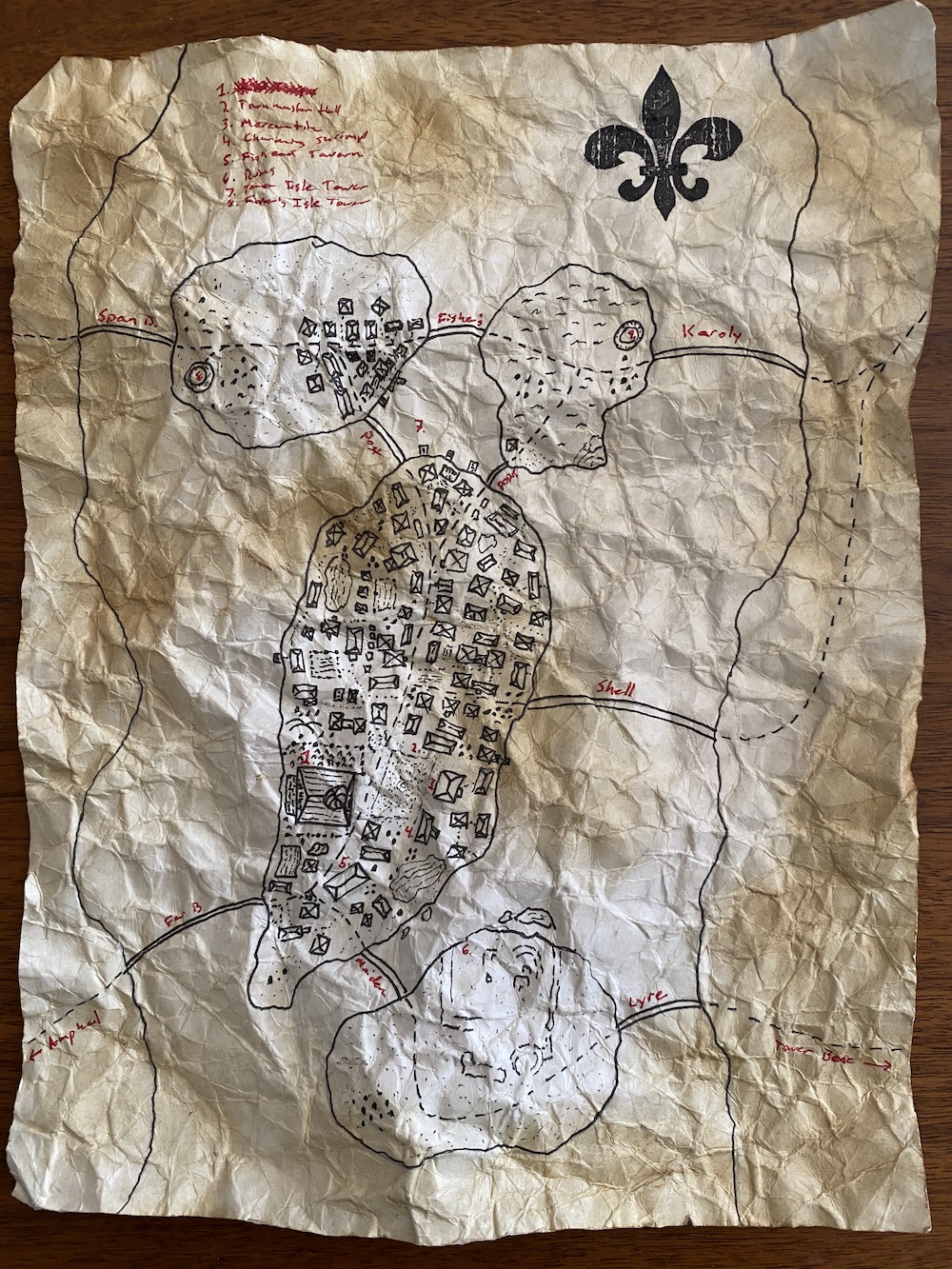
That’s it! When you are done with these steps, your map will look like the picture at the top of this article. Remember that the spell scrolls article has a few different options for the techniques I covered here. That might inspire you to try out a few other things.
Telling a Story
Still worried about those imperfections in the map? Here’s one more tip: Give the map a little bit of history. Tell a fragment of the story that answers the question “why does the map look this way?” Here are a variations of lines I’ve used while introducing the map into a game:
- The scholar sat down and rapidly sketched out a map. “I’m no artist,” she says, “but this should be good enough to get you there.”
- A hand-drawn map sits on the desk in the corner. The pot of ink is now dried and the quill pen snapped. But you can see that the gnome had urgently scribbled out directions to the cavern.
- The navigator shows you her chart. While there are numbers and lines drawn with precision all over the map, the islands and the coast are devoid of any decoration. “I don’t care about the houses and castles,” she says, “What’s important to us is the distance to the island, and whether the water between here and there is treacherous.”
- She hands you the map. Blots of ink and water damage are the first clues that she was crying when she drew it. “Please, I hope you can find my sister. Here’s the location of the summer cottage.”
- The map looks ancient, damaged by countless winters. And clearly its original author was no professional cartographer.
With introductions like these, the players don’t expect to get a Mike Schley. They expect to get the chicken scratch of a dying gnome, or the detail-less lines a rushed navigator, or the blotchy scrawl of a weeping quest-giver. Your map’s imperfections are what make the map feel authentic.