Why We Love Gyld Map Pads

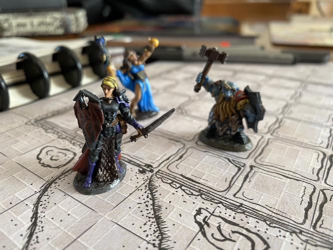
One of our favorite websites for cool D&D stuff is Gyld. And their paper battle map pads are a new favorite of ours. These pads boast one inch grids great for sketching an encounter map that can be dropped right onto the table during the game.
While preparing this story, we noticed that today Gyld launched a new Kickstarter for metal damage dice.
When playing in person, we love to have battle maps right there on the tabletop. When we first got started playing D&D, we used a chess board. From there, we upgraded to a wet/dry-erase laminated battle mat. We still use that quite often, but there are a few things we don’t like about wet/dry-erasable laminated battle mats.
If the DM draws out the map in advance, then we all worry about the ink smudging during transportation or play. But if the map isn’t pre-drawn, then we all have to wait while one person draws out the encounter. (Claire has the best penmanship, so she became our designated map transcriber.)
And when we happened to have more than one encounter in a session, or when the map stretched beyond the border of a single battle map, we had to erase and redraw. In one particular case, Claire got stuck redrawing portions of the map out of place on the mat because we simply couldn’t keep the party together. All of this upset the flow of the game.
We found a solution.
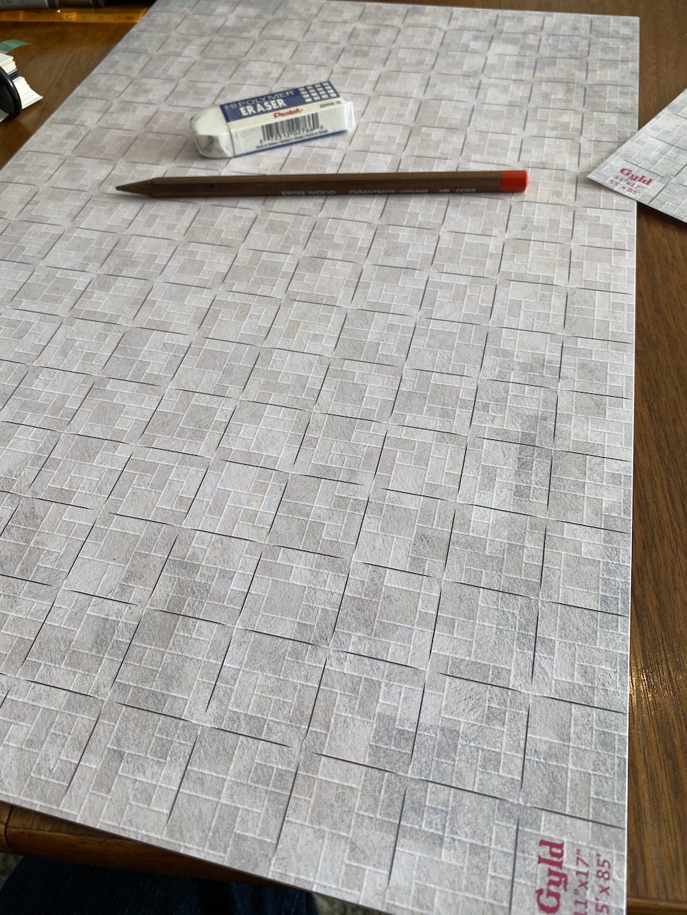
Gyld’s Map Pad is an 11"x17" pad of paper pre-marked with a one-inch grid. Last we checked, Gyld was offering four different prints to add some visual texture: parchment, water, stone, and grass. When Gyld first launched these pads in 2020, we snapped one up. While we haven’t been able to play in person since we got one, we have had a plenty of time to draw out a few test maps. And we really like it.

The 17x11 grid is a good size trade-off. Th pad is not gigantic, and we can typically get a building or two–or a handful of dungeon rooms–on a single sheet. But here’s where the pad is great. The grid extends all the way to the edges of the paper. That means we can stretch out that dungeon over several pages, and then piece them together. Paper is a lot easier to transport than laminated battle maps. It’s no sweat to bring along a dozen sheets in order to construct a sizeable multi-session dungeon. And the DM likes that it’s easy to do a gradual reveal simply by not laying down a sheet until the players have reached that part of the map.
With some clever cutting and folding, you can probably achieve some other cool effects that you just wouldn’t be able to do with a laminated mat. But we’d have to admit that we haven’t tried this yet.
Another nice feature of drawing on paper is that you can make the map as simple or complex as you want. With dry-erase and even wet-erase markers, it always felt like it wasn’t worth the effort to draw more than a simple outline. It was just too easy to wipe or scratch the ink away. The more ink, the more likely the map would get blotted or smudged.
And while Matt, our DM, got into sketching detailed maps on traditional graphing paper, when it was time to play, Claire ended up just copying the basics. After all, every moment we spent drawing the map was a moment we weren’t playing.

The pads are the right alternative. Like to keep the map simple? Fetch a ruler and a pen and outline those rooms! But if you want to get more artistic, sketch away! There’s no fear of accidentally erasing or smudging your existing lines. If you want to give it a splash of color, grab those colored pencils or markers.
We ordered the “stone” map pad, figuring we’d mostly be drawing dungeons. There is a lot to like about this pad. The paper comes on a pull-away pad. We’ve removed a dozen sheets without having a single page tear. The paper itself feels just slightly heftier than notebook paper. We tested with Sharpies, and the paper is thin enough that we wouldn’t recommend using permanent markers unless you put another sheet of paper beneath it.
The stone graphic is great. It is high-quality, and the shading of the stone graphics gives the appearance of depth. On the website, the stone looks grey, but up close the colors are more subtle: bluish grey with just a hint of pink to give it the feel of cobblestone. We love the “instant dungeon” feel.
For two reasons, we wish we’d started with the “parchment” tablet instead of the “stone” one.
Gyld refers to their parchment-colored pad variously as “plain,” “parchment,” and “map”. In the order drop-down, it is called “Plain/Map.” We decided to refer to it as parchment because of the color.
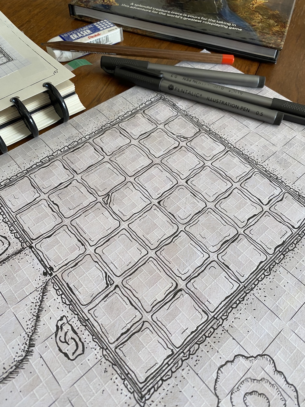
First, the pad with the stone pattern is gridded with black lines. When drawing with a black pen, it is harder for the eye to pick out some of the details. The black grid lines visually compete. In the picture above, we feel like the grid lines really stand out… and we wish they didn’t. (Note that none of the other pads use black for grid lines. Black was probably a stylistic choice for the dungeon aesthetic.)
Second, the other pads all have additional measured dots in each square, which makes it a little easier to do finer details. While the stone’s repeated geometric pattern can be used to measure, you do have to think a little harder about how to position things as you draw.
We also really like the yellowed parchment color. It would be fitting for city-level or regional maps. So in addition to our stone pad, we will probably grab a parchment one as well. That’s another nice thing about these pads. They are cheap enough that you can pick up a couple for the same price as a single laminated battle mat. And you don’t even need special pens!
Overall, we’re thrilled. While we will keep that old wet/dry-erase battle mat around, we imagine that from here on out we’ll do most of our tabletop battle maps on Glyd paper.


